Showing posts with label art. Show all posts

2/05/2015

Weekly Links, 2-5-2015


Writing/Publishing Links:
Kameron Hurley on how "writing every day" doesn't work best for everyone: Life on 10,000 Words A Day.

Alex Shvartsman on The Art and Science of Anthology Editing.

Deborah Ross on How To Succeed As A Writer In 2015.

(I've posted my own comments on the last two.)

Last minute addition: Kristine Kathryn Rusch on Business Musings: Following The Crowd.


World/Political Links:
This story has, rather appropriately, gone viral already, but hey: GOP Senator: Don't Force Employees To Wash Hands After Using Toilet. This is the triumph of ideology over sanity. The GOP's tolerance and endorsement of extremists and public menaces like Senator Tillis is a major reason why I haven't voted for a Republican office-seeker in years.


Related to the above: The Sepsis Alliance is an organization promoting awareness and prevention of sepsis (aka "blood poisoning"), runaway infections that are the third-leading cause of death in the US and leave large numbers of survivors with physical and mental impairments. A primary cause of early infections developing into full-blown sepsis is insufficient education and enforcement of sanitary procedures.


Food/Cooking Links:
Cooking Will Be Suddenly Awesome If You Buy Any of These 19 Products. (Pictured: The Defensive Swordsman.) [via Cascata Nerina]

Modern Farmer gives an interesting overview of The New Food Police.

Oh dang, I missed National Chocolate Cake Day on January 27th! To make up for it, here's baking-savant Dorie Greenspan's recipe for Double Chocolate Marble Cake.


Art Links:
Here, Kitty, Kitty....  Because nothing says "Sci-Fi" like a Cowboy Space Bear riding Rocket Sharks in pursuit of a Space Cat With A Jetpack. Doing it in black-velvet-painting style is a bonus. (Design by Cory Freeman and chazwick31. I liked it so much I bought the t-shirt!)


Zim & Zou are the team of Lucie Thomas and Thibault Zimmerman, French artists who work in paper, leather, and other materials. The image at left is a sample of their work. The link above goes to a large list of other projects they've posted on behance.net.

12/16/2014

Assorted Stuff of Interest

Playboy has a big honking list, ranking all episodes of all Star Trek series ever: "Clues", my episode, is #115 out of almost 700. Not too shabby a number.

- - - - -

Speaking of big lists, among the plethora/tsunami of "Best Books of 2014" lists, the 250-title list from National Public Radio is pretty impressive. The full list can be filtered by various categories for more manageable results.

- - - - -


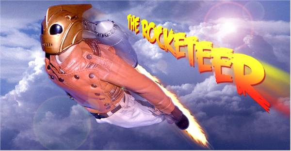
ASU's "jetpack" may be the jetpack we'll get, not the jetpack we want.

This is more of a "jet-assist" invention, being developed to let troops move more quickly in combat situations while carrying a shitload of weaponry and gear.


Any true believer, though, knows that a real jetpack will allow you to fly, dammit!


- - - - -

David Laferierre, an illustrator from Massachusetts, has been drawing on his kids' sandwich bags for their lunchboxes since 2008, and posting photos on Flickr.  One of his common subjects is rocketships. Here are a few:


- - - - -

And, to finish off this post, South Africa's MUTI (I'm not sure if that's supposed to be a name or a company) has designed an impressive poster for Jules Verne's fantastic fictions, Voyages Extraordinaires, incorporating numerous icons for a variety of separate works.  The full poster, and separate renditions of the icons, are on display at behance.net. Below is the icon for From The Earth To The Moon:


6/18/2014

Chihuly at DBG

Last month, Hilde and I and our friend Meredith visited the Desert Botanical Garden in Phoenix, to catch the exhibition of works by glass artist Dale Chihuly before it moved on to a new venue. I took a lot of photos, some of which are below:


(more below the break)

3/05/2014

Brass Brassieres: The Cliche That Will Not Die


So, back in the early days of science fiction, pulp magazines tended to feature garish covers with bug-eyed monsters, phallic spaceships, and -- especially on a magazine called STARTLING STORIES -- skimpily dressed spacewomen whose most striking feature tended to be the brass metal brassieres they wore. Yes, metal. As in cold, hard metal.

Like this:
And this:

And this:
 

And especially this:
No bonus extra sexual subtext
on THIS cover.
Move along, pervert.

That particular trope, memorable as it was (and it was used by critics as an example of science-fiction's essential juvenile/puerile nature for decades), faded away after awhile.  It sometimes appeared on "women warrior" covers for fantasy novels, though that seems to have dropped in frequency as well.  A few notable exceptions include the "Slave Girl Leia" costume from RETURN OF THE JEDI (but then, the whole Star Wars Trilogy -- There can be only one! There was only one! -- was a callback/homage to the old SF pulps), and, in a slightly different design, the ludicrous chain mail bikini worn by Marvel Comics' version of Red Sonja.  (There are also the occasional form-fitting spacesuits or power-armor, but at least they're not bare skin in space!)

So we can all breathe a sigh of relief that the "brass brassiere" cliche has, for the most part, vanished into the dustbin of history.  Right?

Well, not quite.  The BBC television series Da Vinci's Demons (shown on the Starz cable channel in the US) recently put out some publicity stills for the show's second season:


It's official: Brass brassieres are back!

From what I've read about Da Vinci's Demons, the show's first season played a bit fast and loose with historical timelines regarding what happened when, or with the lifespans of various historical characters. (One character depicted as being alive to interact with Da Vinci died, in real life, about thirteen years earlier.)  But they weren't egregiously anhistorical.

For the second season, it sounds like the show's writers are now turning more towards the Holy-Shit-These-Are-GREAT-Drugs! scriptwriting model made popular by ABC's Sleepy Hollow, wherein the historical record is turned inside-out, dressed up in a tutu, and painted in day-glo colors.  (See: Zombie George Washington.) Da Vinci will discover the Americas and have a run-in with the Incan Empire.  Yes, really. One assumes from the photo above that the brass-brassiered beauties are supposed to be the legendary Amazons, or that Da Vinci stumbled onto an Incan fashion-model photo shoot, or, oh fuck, I have no fucking idea what the fuck is going on in that photo, just that it makes me go "GHAAA! MAKE IT STOP, MAKE IT STOP!"


4/23/2013

Self-Publishing: Should I Join The Crowd?

I've been eyeing the explosive growth in self-publishing over the last few years, and pondering the idea of collecting together some of the short stories I've had published over the years.  I'm about 98% decided to go ahead with the idea.

One of the reasons I haven't considered it more seriously until now is that self-publishing was mostly seen as the field of amateurs and not-ready-for-prime-time writers, the people who in previous eras would have paid big bucks to vanity presses for a pallet-load of printed books that would sit in their garage forever afterwards.

The explosion started with the advent of print-on-demand publishers like Lulu.com, where the book's contents would sit as an electronic file on Lulu's servers, until -- Oh, my god! -- someone actually ordered and paid for a single copy to be printed and shipped.  Drawback: Printing books one at a time, even with largely automated and standardized printing technology, made the books pretty expensive.

Enter the spreading democratization of e-books.  The Amazon Kindle, Barnes & Noble's Nook, the Sony Reader, e-reading applications for computers and smartphones, all creating an increasingly large base of customers who are willing to read books off a video display instead of having an actual printed book in their hands.  Concurrent with that, an explosion of services started coming available for ordinary citizens to produce and make available their own works.  (Smashwords is probably the best known.)

The problem is making your e-book stand out from the crowd.  Traditional publishers are still able to provide better design, marketing and distribution resources, even for their shiny new e-book divisions.  Professional writers, if they can, still prefer to be published that way.  But we're seeing more and more pro writers using e-books as a way to replace the largely vanished backlist, to republish their older books that have gone out of print and had rights reverted.  This, in turn, is giving self-published e-books a new measure of respectability.  I think this is a great thing.

But there are still all the amateur and not-ready writers out there still publishing their darlings in the thousands, with their thumbnail images cluttering up display pages on numerous bookseller websites.  It's a mob out there, and you need to stand out somehow.

One way is to have a name.  That's one reason more and more professionals are putting their backlist books online; they're a known quantity, so they make (usually slow, but steady) sales based on that recognition factor.

I don't have much of a name.  People tend not to remember mostly-short-stories writers, even the best (otherwise Robert Reed would be a science-fiction superstar).  My output of short stories, even at my best, was usually only two or three a year, not all of which sold.  Scattered over thirty years, I didn't get published frequently enough to be remembered much between stories, or over my writing career (such as it was).  Google me, and the big-ticket item that stands out is the Star Trek: The Next Generation episode ("Clues") I wrote back in 1990.  That's not fodder for re-publishing.

But a few of my stories still get occasionally remembered and inquired about, particularly "Death and the Ugly Woman".  So if I were to put together a collection, that be the lead story.  So I've got a little (tiny) (eensy-weeny) advantage over a complete newbie casting their work into the waters of e-commerce.

I've looked over my published stories; not all of them have a crying need to be reprinted.  I'm thinking of collecting about a half dozen of the best published stories, plus a few selections from my unsold efforts.  (Some of those unsold works deserved their fate, but a few of them... they may not have sold, but dammit... they should have!)

One of the most common things that makes people look askance at self-published books are the covers.  Designing a good book cover is a skill.  It's not a skill quickly learned.  I've got a little (tiny) (eensy-weeny) advantage there, too.  I've been putting out fanzines since the early 70's, and have been goofing around with covers and illustrations almost all that time.   Some of those goofing-arounds worked, some didn't, and I hope I've learned a little about which is which in all that time.  Plus I did the rough concept and design for COPPER STAR, the "Southwestern fantasy" anthology I edited and produced for the 1991 World Fantasy Convention.  (It got a professional tweaking before going to press.)

Looking at cover images of self-published books is great fun, if you like having your eyeballs bleed.  There are some... spectacularly dreadful... covers out there.  And lots and lots more that loudly go *clunk* or are just just unimpressive.  So one of the most important things I'd want would be a striking cover.

I've been looking at a lot of images online.  Because I'm a tightwad, I'd prefer to use cover elements available under public domain.  A detail from Heironymous Bosch got strongly considered; some other images got considered and abandoned.  I also came across a couple of pieces on DeviantArt that could have been suitable, if I decided to go ahead and pay for repro rights.  But then I stumbled across the work of Kathe Kollwitz, a German Expressionist artist in the early part of the 20th Century.  In particular, a 1921 print called "The Widow" seemed to have strong resonance with the themes of sorrow and loss in "Death and the Ugly Woman".  In keeping with the laudatory principle of K.I.S.S. (Keep It Simple, Stupid), I worked up a cover rough using just black and white and red.  I think it works pretty well.

This isn't a finished cover yet. The title font has some clear kerning problems, and the author-name font looks too heavy. I put this together using some of the default fonts that came installed with Word 2007, and the final fonts will almost certainly be different.  Typographical placement and size will probably be tweaked a bit, too.  But it shows what I'm trying for, and I think it works pretty well.
 
A cover's just one step. Final decisions on contents, supplementary material, page design, proofreading, ISBN and barcodes, pricing, etc., etc., are still ahead.  Plus considerable study and fiddling around with software and resources to make it the best I can make it.  (thebookdesigner.com has a lot of useful articles.)  I figure it will probably be several months before the collection is available, probably longer if my second shoulder surgery happens in the interim.


4/15/2013

Paolo Soleri, 1919-2013


I've been surprised that I've seen so little mention in science-fiction circles of the April 9th death of visionary architect Paolo Soleri. Soleri originated the term "arcology".

The idea of an arcology is an imploded city, the opposite of sururban sprawl. His massive book, THE CITY IN THE IMAGE OF MAN (1969), featured drawings of massive (but relatively small-footprint) self-contained cities, cities that reached high into the sky and deep into the ground. Because they were designed to be self-contained and self-supporting, they could be located in marginal areas. (One design was for a city using air-space by spanning a section of the Grand Canyon.)


A 2011 article on ARCH DAILY gave a good overview of his life and career.  He spent more than forty years slowly building a small-scale version (5,000 intended population) arcology, Arcosanti, still not complete, in rural Arizona, assisted by students and acolytes.  With shoestring funding (mostly by sales of ceramic and metal bells made by Soleri) and built largely with hand labor, even the fraction completed so far is impressive. 

I believe Soleri's work was one of the big inspirations for Robert Silverberg's "Urban Monad" stories (collected as THE WORLD INSIDE), tales of life inside mile-high skyscraper-cities.  Soleri's work and ideas have influenced other writers' "future cities" as well.

Personally, I came across a copy of CITY IN THE IMAGE OF MAN in the Arizona State University library in the early 1970's.  (It's fair to call it a coffee-table book; it's literally about the size of a coffee-table top.) "Wow," I said as I paged through it.  "Wow."  Sensawunda extreme.

Soleri may not have been a science-fiction writer, but his vision and ideas have surely influenced the field.  So, again, I'm surprised that I haven't seen more SF people commenting on his death.

Paolo Soleri, 1919-2013

3/30/2013

Tsundoku, and the Ace Science Fiction Specials

If I had a word tattooed on my forehead, it would likely be this one:


I think I've mentioned before that I tend to buy more books than I have time to read.  When you've been doing that for forty years, your TBR pile tends to get, umm, large.

The oldest book in that TBR pile (which is actually multiple piles, and shelves, and boxes) is one of the old Ace Science Fiction Specials, Bruce McAllister's Humanity Prime:


I actually took this with me to Army Basic Training in 1972, with the intention of reading it in my spare time.   HA-HA-HA-HA-HA!  Spare time in Basic Training?  What a charmingly naive concept.  In the years since then, it's floated around wherever I've lived, sometimes in handy reach, sometimes in an accessible but inconvenient spot, and sometimes unfindable for years at a stretch.  (Current status: unfindable.)

I think one of the reasons I never quite got around to actually reading the book is that it reminds me of a sad moment in science fiction history.  Humanity Prime was the first Ace Science Fiction Special to not have a cover by Leo & Diane Dillon.

The Ace Science Fiction Specials were edited by Terry Carr at Ace Books.  Carr was the junior SF editor at Ace, under the senior SF editor Don Wollheim.  Wollheim discovered science fiction in the 1930, while Carr was a generation younger, becoming active in SF fandom in the 50's.  Ace Books' SF line, while having some gems, was mostly oriented towards a more pulpish, action-adventure style of plotting and writing.  (Not that there's anything wrong with that.)

In the 1960's, SF began going through a period of experimentation and horizon-expanding, as a new generation of writers, dissatisfied with the pulp traditions and styles of most SF, tried to write new works of greater depth and style.  (The "new" generation included some established writers like Robert Silverberg and John Brunner, known for rapidly-written slam-bang SF stories and novels, who chose to stretch their abilities in new directions.)

Terry Carr was more open to this new style of SF, and he was able to get Wollheim and their bosses at Ace to approve a "Special" line of Ace books, giving these new and upcoming writers a venue for their books.  A significant number of the Ace Science Fiction Specials that Carr brought out have gone on to be regarded as classics of the SF genre.  (Left Hand of Darkness by Le Guin, Pavane by Keith Roberts, Past Master by Lafferty among them.  Many other titles in the line were nominated for or won Hugo and Nebula awards.)

The Specials were distinguished from Ace's regular line of books by having distinctively styled covers, done by Leo & Diane Dillon.  The Dillons' paintings were done in styles more reminiscent of other media (stained glass, batik fabric patterns), "artistic" as opposed to the pulp-style "illustration" of most paperback covers.  Here are some of my favorites:


The bad news was: The Ace Science Fiction Specials didn't sell as well as hoped.  The books, and their covers, were getting great respect and admiration, and occasional awards, within the SF field, but not from the buying public.  Ace Books decided (I'm not sure from what level, Wollheim or someone higher) that the covers were just too unusual; the public didn't recognize them as science fiction.  So the Dillons were dropped as the cover artists for further Specials.

The Davis Meltzer cover for Humanity Prime is not a bad cover.  But it's not a great cover, either.  I'm still a bit wistful that we never got to see what the Dillons might have done with this book or the others in the Specials line.  And I think that regret may be part of why, in all the years since I first bought it, I've never actually read the book behind that first non-Dillon cover.  To me, a cover by the Dillons was an integral part of an Ace Science Fiction Special.